Lanier College & Career Academy
BRANDING REFRESH FOR HIGH SCHOOL

Timeline
Fall 2019
Client
Lanier College & Career Academy
Project Brief
Refresh for LCCA's branding to complete their recent rebranding efforts and finalize all logos.

My Role
The original logos were created by Cotton Eyed Joe’s of Gainesville, GA. The branding refreshing efforts were spearheaded by myself alongside LCCA’s CEO. I directed and implemented all major changes. CEJoe's did all finishing touches and font selections.
Tools
Illustrator
LCCA LOGOS
The branding refresh started with LCCA’s primary logos. The areas between the letters were inconsistently filled in. They were also originally designed at a slight angle. This did not work well in practice because the slant was so slight, it alway appeared as if the logo was on the letterhead or apparel crooked instead of an intentionally slanted.
The school also lacked a logo where the entire name of the school was easily read. These issues were addressed in the refresh by straightening the original logo and by adding a wordmark that used a flag-like structure to relate to the school’s patriotic colors.
BEFORE
AFTER

THE OAKS LOGOS
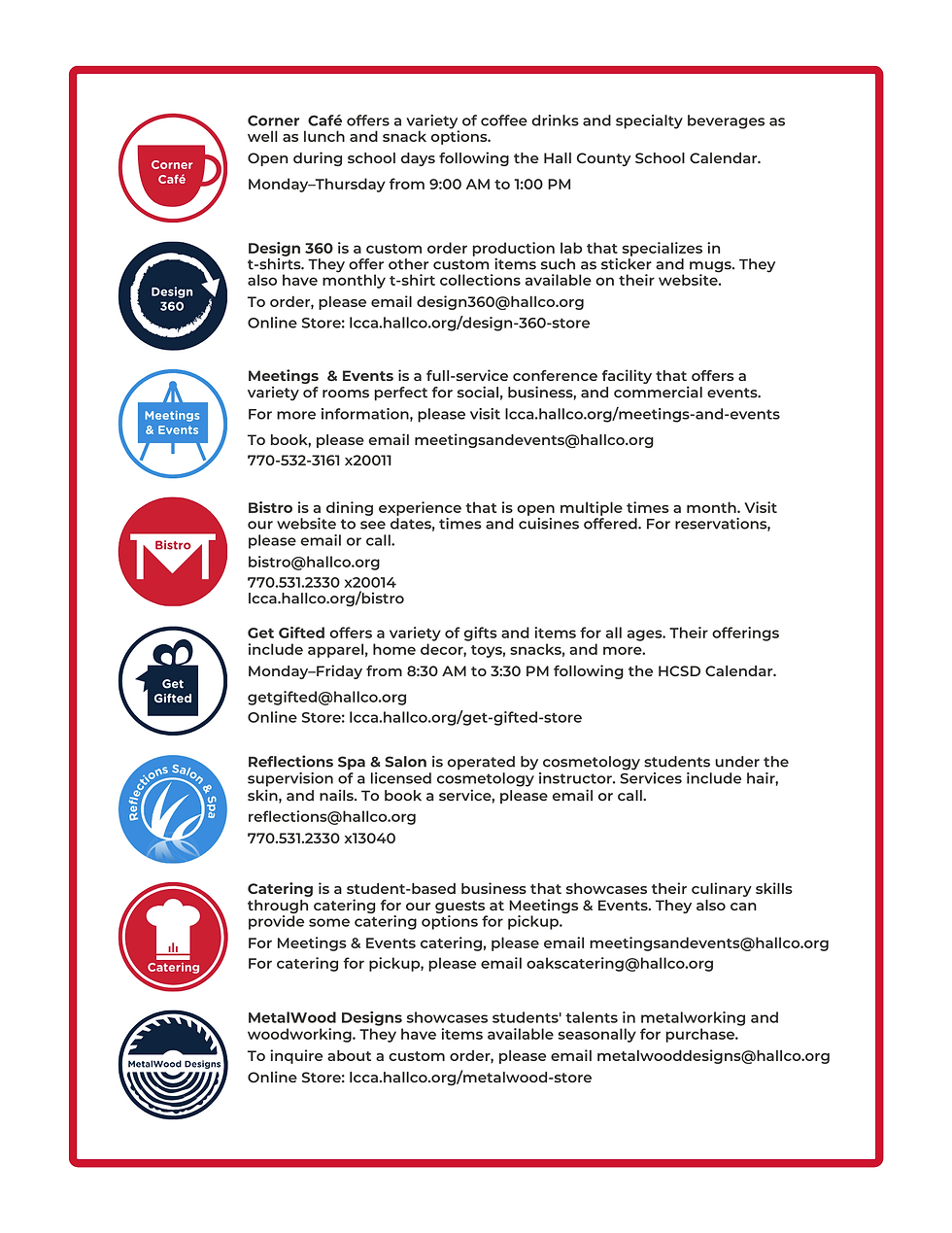
The next area of focus during the branding refresh was The Oaks’ logos. The Oaks Building is a secondary building on LCCA’s campus that houses the student-based businesses such as Bistro, a restaurant, and Get Gifted, a gift store. The building was built to curve around a large oak tree on the property. The Oaks’ logos were forgotten in past rebranding efforts and not updated to the new school colors. They had entirely different branding than the rest of the school. During the branding refresh, the colors were updated to match the rest of the school. The “Oak Tree” logo structure was updated along with the indivdual businesses logos. There were also new business logos added and the logo of a business no longer in operation was removed.
BEFORE
AFTER

ADDITIONAL LOGOS
A few additional logos were also added during the branding refresh. These were done for the three main programs LCCA focuses on. This was done to further emphasize the importance and distinction between the different programs as well as to keep the iconography consistent within programs for all printed and digital collateral.

UPDATED PRINT COLLATERAL


ADDITIONAL PRINT COLLATERAL
Additional print collateral was created to give visitors even more information on the different aspects of the school and its student-based businesses.